
Brand your patient app
Updated Last verified against the product
In short
To brand your patient app in Velarya, open Organization settings > Business & App. In the App card, set your Brand Colour, write About Us, add your social links and select Save, then upload an App Icon for Velarya to review. Patients see it in the Velarya app, or in your own app on the Branded and Connected plans.
- Who can do this
- Admins and roles with App & branding set to Edit
- Applies to
- Your whole practice, every location
- Plans
- Basic, Scale, Branded and Connected
- Time
- 10 minutes
Before you begin
- For the app icon: your logo or icon as a PNG file, at least 1024 by 1024 pixels and under 10 MB.
Set your brand color
Your Brand Colour is the color Velarya uses for buttons, links, highlights and card tints across the patient app. You set it once for the whole practice, in the App card of Business & App.
- Open the menu at the bottom of the left sidebar and select Organization settings. Business & App opens first, with the App card below Business Profile.
- Select the color code next to Brand Colour. A color picker opens.
- Pick your color, or type its hex code, such as #1F6F5C, in the box at the bottom of the picker.
- Select Save in the Unsaved changes bar at the top of the page. The bar closes, and patients see the new color the next time they open the app.

The Unsaved changes bar appears as soon as you change any field on the page, and Discard puts every field back. When you have changed both cards, the bar reads 2 unsaved sections and Save saves both.

The app builds a set of shades from your color’s hue: a faint tint behind cards, a vivid medium shade on buttons and links, and a deep shade for headings and the selected tab. Your online booking page uses your color for its buttons too. Until you save a color, patients see Velarya’s purple.
Add your About Us text and social links
About Us and your social links fill the About section and the row of link buttons on the Home tab of the patient app.
- Type a short introduction to your practice in About Us, up to 2,000 characters.
- Enter the full web address of each profile in Instagram, Facebook, TikTok and YouTube, starting with https://, for example https://instagram.com/yourpractice.
- Select Save in the Unsaved changes bar.
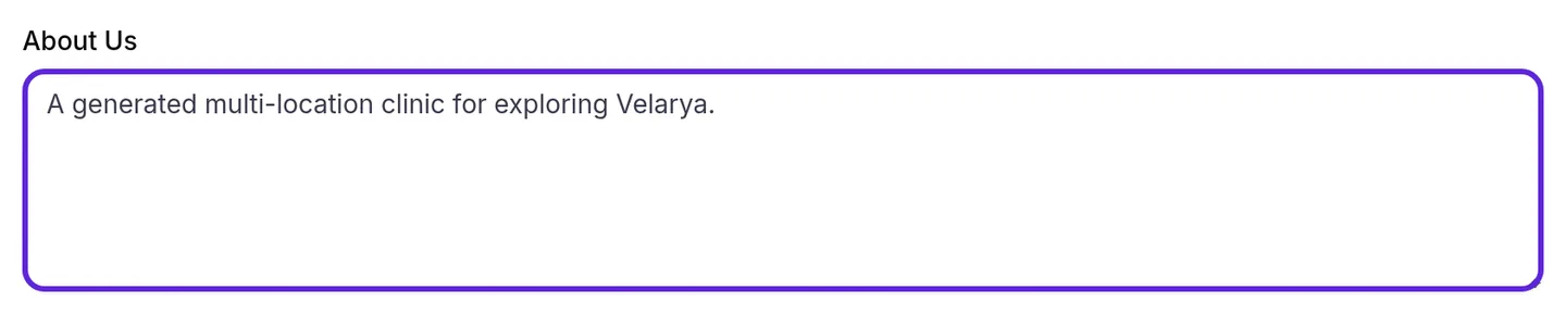
Leave a social field empty and the app shows no button for it. The Website and Call buttons in the same row come from Website under Contact details in Business Profile and from the phone number of the patient’s location.

Submit your app icon
Your App Icon is the image Velarya reviews and builds into the app, ideally square. On the Branded and Connected plans it is the icon of your own app on patients’ home screens and on its sign-in screen. On every plan, Velarya shows it as your practice’s logo in the Velarya app’s practice search and My clinics screen, at the top of your online booking page, and on the invite page a patient’s referral link opens.
- Select Upload icon next to App Icon. Once you have submitted an icon, the button reads Replace icon.
- Drag your PNG into the box, or select Browse files. The file must be a PNG, at least 1024 × 1024 pixels on both edges, and under 10 MB.
- Choose a shade under Icon background. The seven shades come from your saved brand color. For your first icon, Velarya selects the shade that stands out best against it, labeled suggested. The iOS and Android previews show the result.
- Select Submit for review. “Icon submitted for review. We’ll let you know within 1 business day.” appears, or a note that Velarya filled your icon’s transparent background with your chosen shade, and the App Icon row shows Pending review.
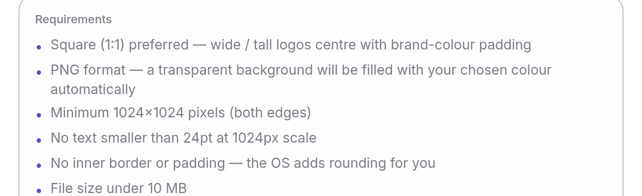
The App Icon row follows your latest submission through review:
| Status | What it means |
|---|---|
| Pending review or Under review | Velarya is checking the icon, usually within 1 business day |
| Approved | The icon passed review and goes into the next app release |
| Needs changes | The reason shows underneath with any note from the reviewer, such as “Text inside the icon won’t be readable on a phone home screen.” |
| Scheduled | The app version the icon ships in |
| Live | Patients have the icon, with the date it went live |
What do patients see?
Patients see your branding in one of two apps. On the Basic and Scale plans, they use the Velarya app and choose your practice in it. On the Branded and Connected plans, they use your own app, listed in the stores under your practice’s name. The Velarya app and your own app carry the same program.
| Setting | Where patients see it |
|---|---|
| Brand Colour | Every tab: buttons, links, the tab bar and card tints, plus the round check-in button on Home and the QR code it opens. On the Rewards tab, the Available balance card is a gradient of your color, the points panel and challenge cards are tinted with it, and Redeem and each challenge’s reward show in it. Your online booking page uses it for its buttons |
| About Us | The About section of the Home tab: the first four lines, then View More for the rest |
| Social links | A row of buttons on the Home tab, below About, next to Call and Website, that open your profiles |
| App Icon | Your own app’s icon and sign-in screen (Branded and Connected); your logo in practice search, My clinics, your online booking page and the referral invite page (every plan) |
| Display Name, in Business Profile | Your practice’s name in the app, in the referral invites patients share and on the page their link opens, and the name of your own app |
A patient who uses more than one practice in the Velarya app sees each practice in its own colors as they switch between them in My clinics. The points panel on the Rewards tab shows each patient’s balance and its value in credit, as described in Set up points earning. In your own app, push notifications arrive from your app under your name; Loyalty notifications patients receive lists what each one says.
How does app branding behave?
| Situation | What Velarya does |
|---|---|
| You save a new Brand Colour | Patients see it the next time they open the app, in the Velarya app and in your own app |
| Your color is pale, muted or very dark | Keeps your color’s hue and sets each shade to a fixed depth, so buttons show a richer, medium version of it |
| Your color is black or grey | Builds grey shades |
| About Us is empty | Shows no About section on the Home tab |
| About Us runs past four lines | Shows four lines with View More |
| Your icon has a transparent background | Fills it with the shade you chose under Icon background |
| Your icon is not square | Centers it on your chosen background, as long as its longer edge is at most 4 times its shorter edge |
| You submit another icon before the last one ships | Follows the newest submission in the App Icon row |
If something goes wrong
“Use a hex color like #5B8DEF” under Brand Colour. The color must be a hex code: # followed by six digits and letters from A to F. Pick the color again, or type its code in the box at the bottom of the picker.
“Maximum 2000 characters” under About Us. Shorten the text to 2,000 characters or fewer, then select Save.
“Enter a valid URL” or “URL must start with http:// or https://” under a social field. Paste the whole address from your browser, such as https://tiktok.com/@yourpractice, rather than your handle alone.
“Couldn’t save app content” and “Fix the highlighted fields before saving.” A field in the App card has a message under it. Correct that field and select Save again.
The icon upload says the file is too large, not a PNG, too small, or its aspect ratio is too extreme. Export the icon again as a PNG, at least 1024 pixels on each edge, under 10 MB, with its longer edge no more than 4 times its shorter edge.
Submit for review stays greyed out. Upload a file first. For an icon you already submitted, choose a different Icon background shade to submit it with a new background.
The App card is greyed out, or Business & App is missing from the menu. The App card needs App & branding at Edit. The page itself opens for roles with App & branding or Organization profile / business details at Edit. Ask an Admin to update your role in Roles & Permissions.
Frequently asked questions
Was this guide helpful?
Last verified
What changed
- : Your app icon and Display Name now also appear on the invite page a patient's referral link opens.
- : Re-verified against the code: buttons use a vivid shade of your color's hue, the online booking page uses your color, the social buttons sit below About, the Display Name also appears in referral invites, your logo in practice search changes when you submit an icon, and the icon rules, submit message and troubleshooting cover icons that are not square.